An abstract sensory representation of the worldwide chaos, anxiety and paranoia during the Vietnam conflict in the late 1960's:
Thursday, April 11, 2013
Wednesday, April 3, 2013
3:37
For this assignment, I wanted to use recorded sound to create a sensory experience for the user by building and releasing aural tension. Combining recorded sounds and existing recorded music, I manipulate pitch, speed and tempo to create a dark underbelly of noise within a complex soundscape.
Wednesday, March 13, 2013
Photoshop Phun
Photoshop is not usually my friend, but we got along just fine for this assignment. In these photos, I experimented with curve levels, saturation, contrast, color and a little clone patterning.
ORIGINALS
Thursday, March 7, 2013
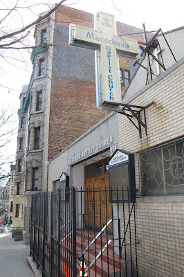
7 Shades of Harlem
Tuesday, February 26, 2013
Pictures of Kitties, Buildings and Food
On Sunday, I took a walk along the High Line and Chelsea Market before going to a friend's to play with her ADORABLE kitties, Punker (in orange) and Norma Jeane (in black). For my street photography, 4/5 are indoor shots. My Landscape/ Nature has a more urban vibe. Looking back, I would visit a more diverse location to get a wider field of photos to choose from. Digital Photography is not my game, but I'm learning and I'm not totally disappointed with how these turned out:
PORTRAIT
STREET
LANDSCAPE/ NATURE
Tuesday, February 19, 2013
Two Imaginary Businesses
Relive the Best Moments from the Biggest Films |
|
|---|---|
WWW.OSCARGIFS.TUMBLR.COM
I've created a digital, gif-tastic ad for my imaginary tumblr blog dedicated to gif-ing the Academy Awards, both past and present. Here, I experiment with timing, gesture and celebrity to entice the user to check out this unique blog that celebrates excellence in film with a touch of humor. By creating an 'alive ad', the advertisement takes on a life of its own and elevates the blog to higher expectations and excites the consumers to learn more.
###
As a complement to my digital ad, I also created this 2D ad for my fake Foodstagramming business. By highlighting my services with an enticing photograph and utilization of white (well, brown) space, I show off an enticing product that will appeal to a broad audience of people who simply can't be bothered with using Instagram while they eat.
Wednesday, February 13, 2013
Queer Imagery in Advertising
The secret to a good Queer Ad is surprise and contrast. Bud Light, usually associated with dudes at a football game or girls in bikinis, finds itself in a dimly lit [presumably gay] bar. The contrast between the bright blues of the bud light and the bar's hue highlights the brand's wide appeal and inclusion for all lifestyles. The position of the two gentlemen tell a very clear story that is paralleled by Bud Light's more hetero-normative ads- drinking beer makes others find you sexier and will help you get laid.
Oh, Manhunt. I find this Ad interesting chiefly because of its location- in the heart of Times Square where countless people, gay and straight, walk below it every day. The Ad embraces simple contrast- text vs. hard bodies. It sells a desirable fantasy- use your smartphone to get laid anywhere, maybe even in Times Square.
Ripped from the pages of GQ, RayBan's bold ad effectively shouts out the brand's long, proud history and broad inclusion of all lifestyles. The copy is simply and demands a call to action particularly profound to queer consumers.
To celebrate their centennial, Oreo launched a 100-day social media campaign beginning with this bold statement affirming the brand's status as a Queer ally. The campaign continued with visually similar images, but this one particularly stood out for many. It's bright simplicity is full of contrast between image and text. Again, Oreo surprises its consumers by altering the traditional Oreo into this [probably delicious] creation.
2012 was a big year for JCPenney. Maybe not financially, but certainly in establishing themselves as a Queer Ally. With the hiring of Ellen Degeneres as their spokeswoman, JCPenney quickly followed up with this provocative Father's Day ad. The small print copy reads, "What Makes Dad So Cool? He's the swim coach, tent maker, best friend, bike fixer and hug giver - all rolled into one. Or two." The ad is simple- an energetic photo paired with heartfelt copy that both surprises the consumer and assures them that JCPenney is a progressive, inclusive brand that cares about its consumers as much as it claims.
Subscribe to:
Comments (Atom)


